Quotas

Using data visualization to support a decision-making process

Challenge

During a licensing process, the user has to make a decision regarding dozens of requests in a short time. Many quantitative and qualitative factors influence the decision. A wrong decision might end up costing the applicants a lot of money or lead to legal action being taken against the department.

Solution

An interface for displaying information about all requests, including data visualization and the ability to make decisions quickly.

Research

User research

I started the research by reading the approval process policy. This policy describes the criteria and the general process of approval. After that, I interviewed the main user of the feature. During the interview, the user showed her working method, and presented us with an Excel file that she used to document her actions. I later used this file as an initial model for the design.

User's pain points

  • Time pressure - The user has to make a lot of decisions in a short time.
  • Many distructions - Phone calls, questions from coleagues, etc.
  • Expensive mistakes - Making a wrong decision might cost the applicant or the department a lot of money, and can result in a lawsuit against the department.
  • Lack of information - Some of the information is owned by other organizations. Getting that information requires an effort.

User's needs

  1. Prevent mistakes - The process requires great precision. Making a wrong decision may cause a financial loss. Therefore, users need a tool that will prevent them from making mistakes.
  2. Context - The decision made regarding each request depends on the context. Users need to see data about other requests in order to make a decision regarding the current request.
  3. Iterative actions - There might be dozens of requests to be processed in each approval category. All the applications are processed together, one after the other. A decision made regarding one application may change the decision made regarding an application that has already been processed.
  4. Data visualization - There are many different criteria for making a decision regarding each request. Most of the criteria are based on quantitative data. Therefore, the users need a tool that will allow them to check this data before making a decision.

User flow

Based on the research, I created a user flow to describe the main decision making process.

user flow

Solution

Low fidelity wireframes

I started by creating a basic sketch of the screen area and their functional roles.

Then, I used the “crazy-8” method to open my mind for various solutions.

low fidelity wireframes

High fidelity wireframe

Finally, I’ve created a high fidelity wireframe using Axure RP (Note: All the data in the wireframes is fake. Importers names and IDs, quotas names and numbers, categories and quantities are different in reality).

Key Decisions

A. Progressive disclosure

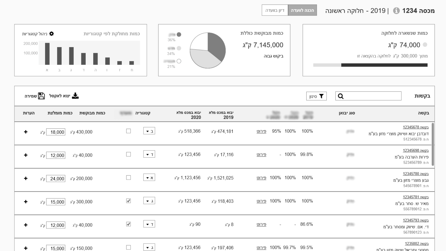
When I started the design process, I thought the user needed a detailed information about each quota so she can recognise it. Then, I noticed that she referred quotas mainly by their ID numbers. Each ID number was 3-4 digits, and easy to remember. As an expert user, she knew those ID numbers well.  

Therefore, I decided to show only the quota's ID on the initial display. The user has to click an "Info" icon to show all the quota's details.

B. Modal window

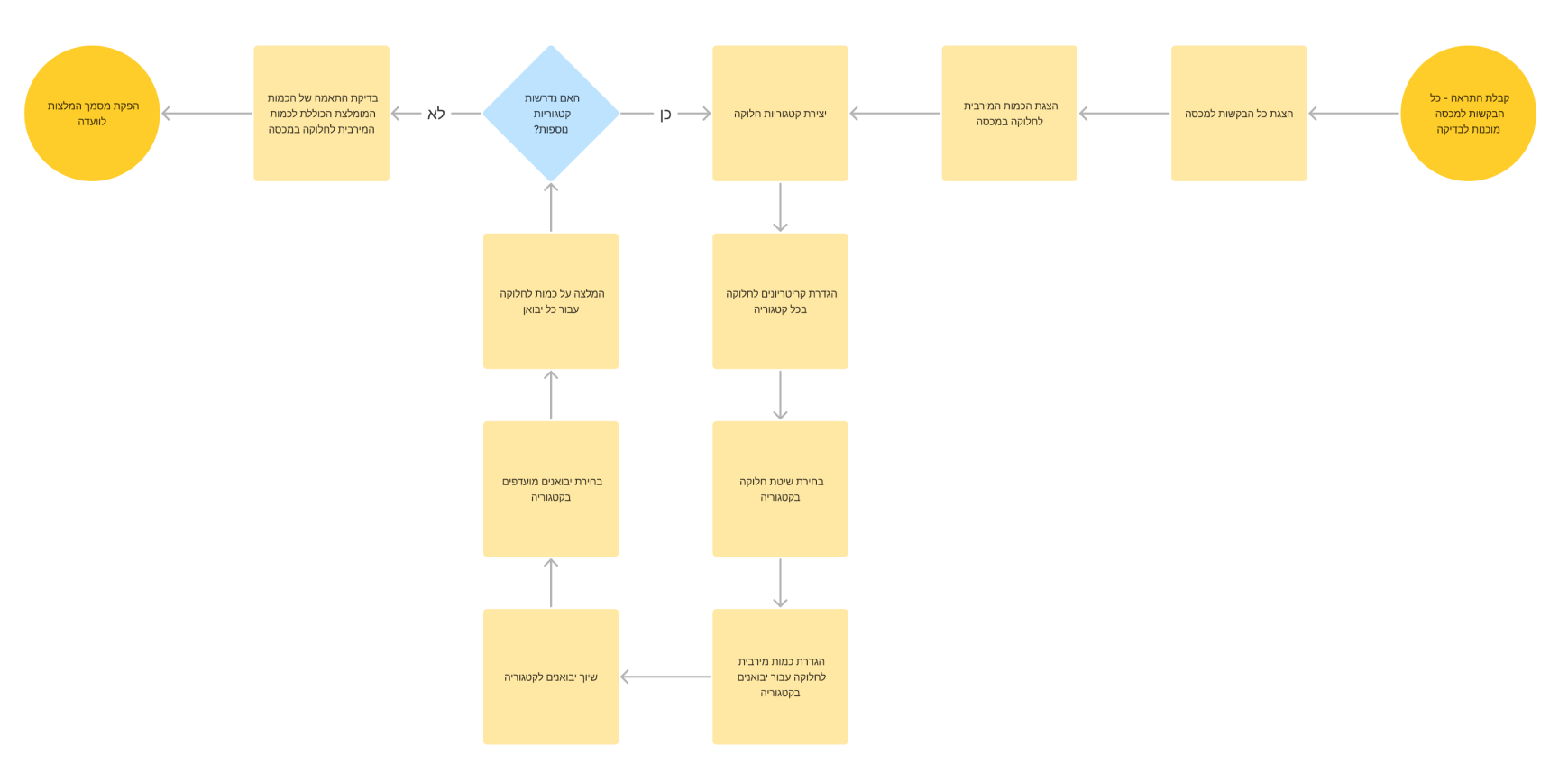
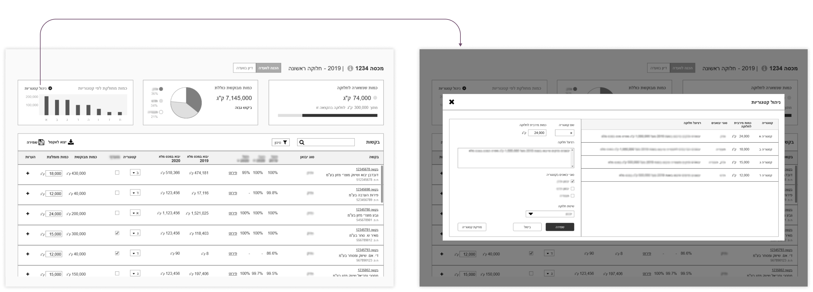
As part of the process, the user creates categories and divides the requests into these categories. In the user research I found out that the categorization process is an iterative process, and the categorization can change on the fly.

I decided to show a short display of the categories, with expanded data in a modal screen. The modal helps the user focus on every category at a time. I also allows to add more information on each category, without losing the context of the other categories.

C. Inline edit

During the process, the user has to divide each request into a category. The operation is performed iteratively on each of the requests in the list (up to a few dozen items).

I decided to allow the user an inline edit, to make the acation quicker. To help the user decide which category to choose, I added a description of each category inside the combo-box.

Takeaways

  1. Get advice - I got help with this project from Keren Stern-Ellran. Keren mentored me as a part of the WE community mentorship program. She helped me set weekly milestones, and gave me feedback on the deliverables. Her advice helped me stay focused and create better products in less time.
  1. Understand the current work methods of the user - Only at a late stage of the project we discovered that the user was using an Excel template as an aid tool. This template raised new questions about the process and helped us understand the user's way of thinking. I could have saved time in the design process if I had asked her more questions about her working methods.
  2. Match expectations with the PM before meeting users or stakeholders - I did most of the user research along with the PM. Our user’s schedule is busy, and it’s not always possible to schedule a separate meeting for the PM and the UX designer. On the other hand, PMs and UX designers sometimes have different attitudes and goals. The PM and I could improve the research results if we matched our expectations before the meetings.

See more of my work

Bella Pharm

Expanding a design language to new mobile and desktop products

View project

Plant Doctor

Product design of a B2C Mobile app for amateur gardeners

View project
Like my work?

Let's talk